What are the challenges in creating accessible public transportation? Fundación ONCE, Spain’s largest organisation for people with disabilities, tackled this question with our multidisciplinary design team.
In order to better serve their member organisations and the people they represent, Fundación ONCE wanted to find a standard way to detect real user needs and execute agile solutions. We needed to define and test a pilot methodology that could be scaled to help Fundación ONCE in a range of fields, from healthcare to education. Enhancing access to public transportation was the focus of the pilot program, with an eye towards how it would eventually be applied to all of Fundación ONCE’s initiatives.

We divided the project into four phases – qualitative research, finding opportunity spaces with Fundación ONCE’s technicians, ideation with accessibility experts, and a development plan to prioritise next actions. In order to understand the obstacles of public transportation access from all angles and forms of disability – visual, aural, mental, intellectual, physical, and those with multiple impairments – we created six focus groups of under ten people with a mix of different disabilities.
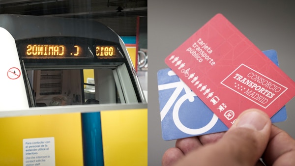

Our research revealed four main opportunity spaces that we turned into an impact diagram for each disability. The diagram has three different levels:
1) This stops me from traveling
2) This makes traveling difficult
3) This makes traveling uncomfortable
This deliverable can be read on two different levels – the opportunity spaces presented for Fundación ONCE, and the challenges faced by each group of persons with disability.
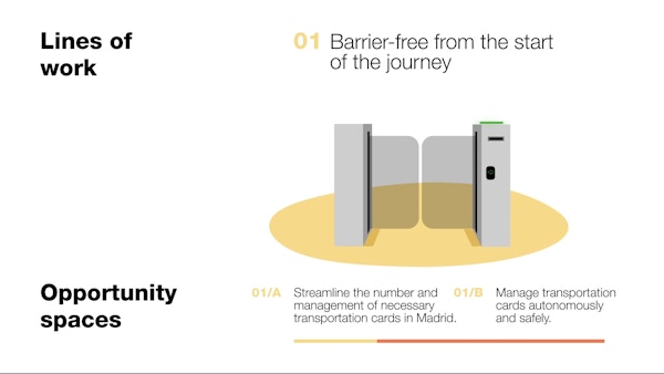
We built connections between Fundación ONCE and their member organizations to facilitate communications, and we created a common framework that addresses all the barriers to making public transportation accessible. Going forward, Fundación ONCE will be able to push initiatives and projects on the same path.
‘Working with everyone from managers, designers, and users has been essential in defining our challenges and future avenues of research. Designit has been crucial in identifying future opportunities and user needs.’

Jose Luis Borau Jordán
Architect and Head of Physical Accessibility Department, Fundación ONCE
SDG 10: Reduce inequality within and among countries
Through its programs and partnerships, Fundación ONCE is helping create more accessible and inclusive services in Spain.
Details
Client
Project team
Contact info for Naty Gomes
Senior Service Designer,
Madrid
Contact info for Jesús Sotoca
Insights and Strategy Director
Contact info for Estíbaliz Franco
Filmmaker
Contact info for Fredi Vallina
Lead Designer
Contact info for Julián Giménez
Digital Designer,
Madrid
Get in touch
-

Naty Gomes
Senior Service Designer,
Madrid -

Jesús Sotoca
Insights and Strategy Director
